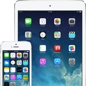
Apparently over half of iOS users updated their devices since last week’s release. Very impressive – the hordes even managed to overload Apple’s servers on the first day. This shows how interested people were with this operating system update. Regardless if you’re an Apple fanboy/girl, there were some features worth looking forward to.
Apple has done a great job at keeping most of the features compatible back to the iPhone 4 and iPad 2. This can’t be overlooked, as there aren’t many tech companies that show so much support for anything but the latest device. Not to ‘trash’ Android OS, but one of the main complaints is how fragmented the Android installed base is with various OS releases (please Google, fix this!). With no further delay, here are some highlights of iOS 7:
- Look & Feel – When the preview came out earlier this year, there were a lot of people complaining that essentially a rookie designer could do better. The consensus now is that the interface is fresh, and more importantly, easier to use. Somehow Apple continues to improve on an interface that we iSheep already think is close to perfect. Thankfully they’ve gotten rid of skeuomorphism – designing apps to resemble their real-world things (e.g. Notes app looking like a yellow notepad, etc.). iOS 7’s functional layers help keep track of where you are – your app icons look to float on top of your wallpaper. Then the Notification Center and new Control Center (see below) are translucent layers on top. Very slick.
- Control Center (swipe up) – The new Control Center
consolidates features users need quickly – all in one spot: airplane mode, Wi-Fi, Bluetooth and Do Not Disturb, screen orientation lock, brightness. music playback control, AirPlay, flashlight, timer, calculator and camera. Android users have this already, but Apple has caught up and then some. There is a lot of control in one swipe – incredibly easy and handy – even from the lock screen!
- Task Manager (double click Home button) – This is a much
more intuitive way to manage you tasks than before. When you’re in the task manager, you can see what you’re doing in each app with a little preview. As before, you can touch it to switch to that app, or simply swipe it up to quit it.
- Photos App – Your photos are now organized by Collections and Moments – organizing your photos by place and time automatically for you. It seems that Apple has nailed photo management on iOS 7, so perhaps they can now share that with iPhoto on the Mac.
- Safari – First, the unified smart search and address bar is long overdue, but now that iOS Safari has it, all is forgiven. The new tab view is excellent. Not only is it a much easier way to see your tabs, the integration of your other devices’ open tabs via iCloud is sublime. Overall they’ve done a great job with usability including having the buttons disappear until you scroll to make them appear.
iOS 7 will likely have some updates to smooth out a few wrinkles, but its very robust and ready for the masses. That said, there are more than a few apps that are experiencing difficulty in the new iOS, so you may want to hang back for a few more weeks. When you do update, you’ll likely be pleased with the work from the folks in Cupertino.
